%20scilla.studio.svg)

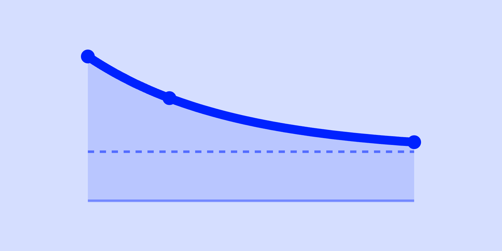
A retention curve has two things worth reading, and almost everyone fixates on the wrong one. The slope (how fast you lose users in the first days) gets all the attention. But the plateau, whether the curve flattens out at some non-zero floor or keeps sliding toward zero, is what actually tells you if you have a product people keep coming back to. A curve that flattens at 30% is a business. A curve that never flattens is a leaky bucket, no matter how gentle the early drop looks.
This article walks through how to read both. We'll use the same benchmark bands the scilla.studio benchmark tool charts against, and we'll be honest about where those numbers lie to you.
A retention curve plots the percentage of a cohort still active over time, starting from 100% on day zero. You take everyone who signed up (or activated) in a given week, then measure what fraction of them are still active 1 day later, 7 days later, 14 days, 30, 90, and you draw the line through those points.
Two properties define the shape:
Here's the part most guides skip: a retention curve is really telling you about two different populations stacked on top of each other. There are the tourists, people who showed up, didn't find the value, and left fast. And there are the residents, people for whom the product clicked. The early slope measures how many tourists you let in. The plateau measures how many residents you keep. They are not the same problem, and they don't have the same fix.
The first few days of a retention curve always drop. That's normal: not everyone who signs up was ever going to stick. The question is how much and how fast.
For B2B SaaS, Day-1 retention typically lands at 50 to 70% and Day-7 at 40 to 60% (Pendo, Amplitude, Userpilot). For consumer apps the cliff is far steeper: Day-1 at 20 to 30%, Day-7 at 8 to 15%, and many consumer apps fall below 10% by the end of week one (Adjust, Statista for Day-1; AppsFlyer, Amplitude for Day-7).
| Metric | B2B SaaS | Consumer app |
|---|---|---|
| Day-1 retention | 50 to 70% | 20 to 30% |
| Day-7 retention | 40 to 60% | 8 to 15% |
| Day-14 retention | 35 to 55% | 4 to 8% |
| 90-day retention | 25 to 35% | 1 to 4% |
Sources: Pendo Product Benchmarks, Amplitude, Userpilot, Mixpanel (B2B); Adjust, Statista, AppsFlyer, Amplitude, Mixpanel (Consumer). Do not compare the two columns directly; they follow different growth mechanics.
A slope that's steeper than the band usually points upstream of the product itself. The most common culprits:
Here's what I actually think: the early slope is mostly a leading indicator of your targeting and onboarding, not your product. It tells you whether the right people are arriving and getting to value. It says surprisingly little about whether the product is worth keeping; that's the plateau's job.
The plateau is the level at which the curve stops falling and goes roughly flat. It's the fraction of each cohort that turned into durable, returning users. If you draw a horizontal line through the right-hand end of the curve, the height of that line is the plateau.
This is the single most important thing on the chart, and it's the part founders skim past on their way to obsessing over the Day-1 number. A curve that flattens, even at a modest height, means you've found a group of people who get recurring value and keep coming back. That's the signal of product-market fit. A curve that never flattens, that keeps sliding toward zero month after month, means you have no retained base. You're renting users, not keeping them.
So which matters more, a gentle slope or a high plateau? The plateau, almost every time. Consider two products:
Product A looks healthier on day seven. Product B is the real business. Its sharp early drop is just tourists leaving; underneath them is a solid, flat resident base that compounds. Product A has no floor: give it enough time and the base erodes to nothing.
The B2B benchmark curve the tool charts against settles into the 25 to 35% range by Day 90 (Pendo Product Benchmarks); below 20% at 90 days is a red flag for B2B. For consumer, the floor is brutally lower, at 1 to 4% at Day 90, and anything above 5% is exceptional (AppsFlyer, Adjust). The absolute height differs wildly by category, which is exactly why you read the flattening, not the number in isolation.
This is the judgment call that the chart can't make for you, and it's where a retention curve most often gets misread.
A true plateau flattens and holds. Month over month, the line moves a fraction of a point. A slow bleed looks flat over a short window but is still trending down; it just falls slowly enough that a 30-day view hides it. The difference only shows up over time.
How to separate them:
(And yes, this means an impressive-looking Day-30 number can be a trap if the curve underneath it is still quietly heading for the floor.)
The two parts of the curve have two different fixes. Treating them as one problem is how teams waste a quarter.
To lift the early slope (reduce the cliff): work the path to first value. Shorten time-to-aha, cut onboarding steps, make the core action obvious in the first session, and fix acquisition targeting so you stop importing users who were never a fit. The slope responds to onboarding and targeting changes within a cohort or two.
There's a temptation to chase activation-rate numbers here, but we don't publish benchmarks we can't source, so treat activation as a direction rather than a target. The goal is to compress the path to first value so more of the right users reach the "aha" before they bounce, not to hit some onboarding-completion percentage.
To lift the plateau (deepen retention): this is harder and slower, because the plateau reflects whether the product delivers recurring value to a real segment. You can't onboard your way to a higher floor. You raise the plateau by deepening the core loop, finding the segment for whom the value is strongest and serving them better, and building reasons to return that are intrinsic to the job rather than push notifications bolted on top. Concretely: if your blended Day-90 plateau sits at, say, 18% (under the 25 to 35% B2B band), the move is usually to find the sub-segment that's already flattening near 35% and reshape the product around their core loop, then drag the blended floor up toward the band as that segment grows, rather than running a broad retention campaign. You lift the plateau by serving the people who already get the value better, not by chasing the ones who never will. Be humble here: a low, flat plateau often means the product is genuinely valuable to too narrow a group, and the fix is strategic rather than a growth hack.
One connection worth naming: retention and viral growth feed each other. The more often retained users engage, the more chances they have to generate viral outputs: a daily-active user gives you ~30 shots a month at a referral or shared artifact, versus one or two for a barely-retained one. (We unpack that loop in our K-factor article.) A higher plateau quietly raises your effective K-factor.
A reminder that's central to how we think about all of this: these bands are directional references, not goals. Your business model changes what "good" looks like more than your category does. A freemium consumer app, a self-serve SMB tool, and an enterprise sales-led platform will have three completely different "healthy" curves, and forcing yourself onto someone else's benchmark is a good way to optimize for the wrong thing.
Read your own curve first (find the slope, find the plateau, decide whether it's flattening or bleeding), then glance at the band to see roughly where you sit. The band is a sanity check, not a scoreboard.
If you want to see your retention curve plotted against these B2B and Consumer bands, the free benchmark tool charts your retention, K-factor, and unit economics against industry bands in a couple of minutes, and it shows the flattening, not just the day-90 number. You bring your cohort data; it draws the curve and the band side by side so you can read the slope and the plateau at a glance.
What is a good plateau for a retention curve? There's no universal number; it depends entirely on category and business model. B2B SaaS curves commonly flatten in the 25 to 35% range by Day 90; consumer apps flatten far lower, at 1 to 4%, where anything above 5% is exceptional. The signal that matters is that the curve flattens at a stable, non-zero level, not the absolute height.
Is a steep early drop in retention always bad? No. A sharp drop in the first week is often just tourists leaving, and if the curve then flattens and holds, the product is healthy. A steep slope followed by a solid plateau beats a gentle slope that never flattens.
How long should I track a cohort before trusting the plateau? Long enough to see the drop decelerate and the line hold flat, usually well past 90 days. A short window can make a slow bleed look like a plateau. If retention is existential (it is), wait for the longer cohorts.
What's the difference between the slope and the plateau? The slope is how fast you lose users early, mostly a signal about onboarding and acquisition targeting. The plateau is the durable floor the curve settles at, the signal of whether you've found people who get recurring value. They're different problems with different fixes.
Can I compare my B2B retention to consumer benchmarks? No. B2B and consumer products follow fundamentally different growth and retention mechanics, and the benchmark bands are an order of magnitude apart. Compare like with like, and use the band as a directional reference rather than a target.


