%20scilla.studio.svg)
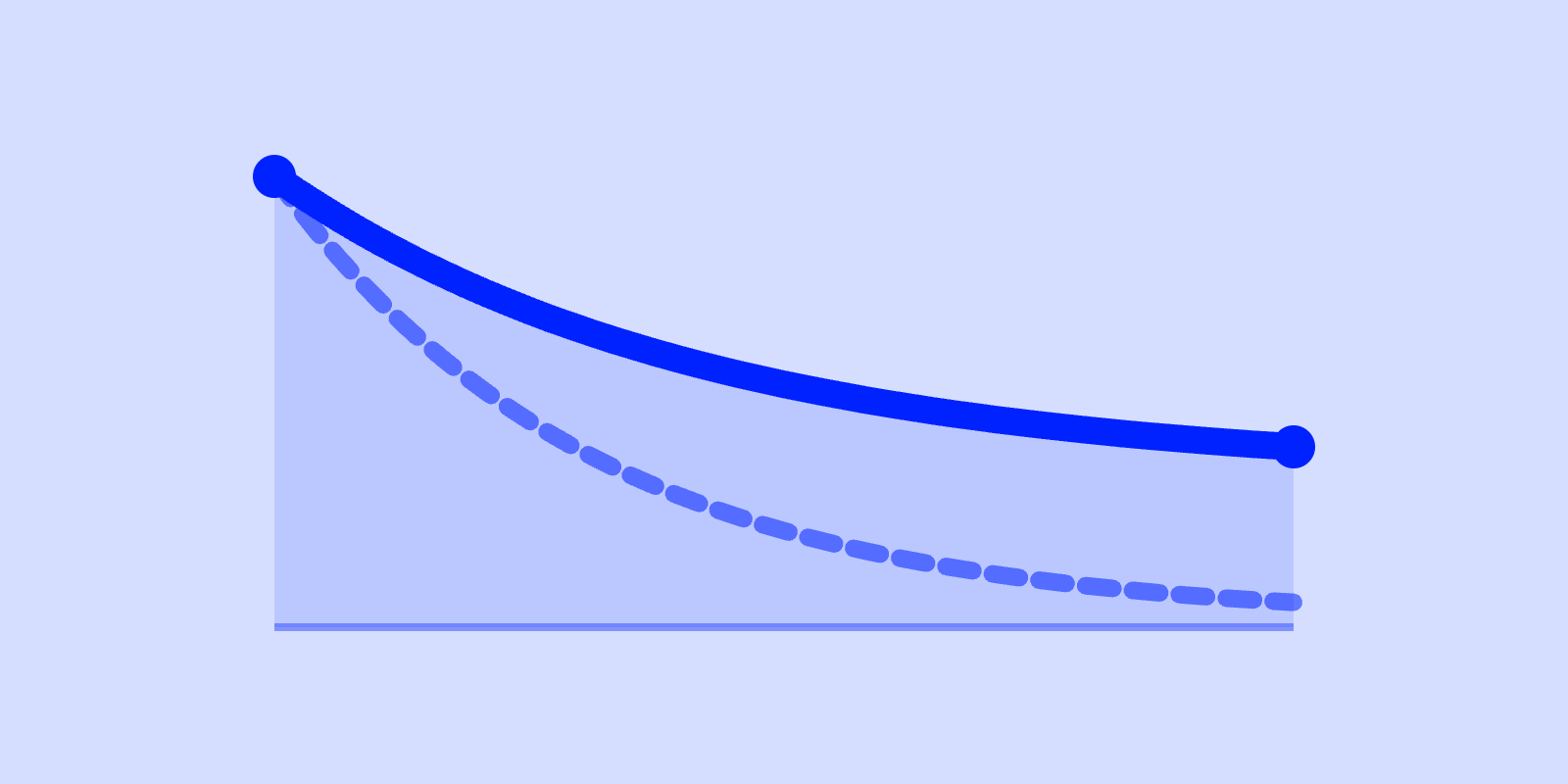
Churn is "normal" when your retention curve flattens: when, after the early drop-off, a stable group of users keeps coming back month after month. That flat tail is a leaky bucket: you're losing some water, but the bucket holds, and the leak is fixable. Churn is fatal when the curve never flattens and keeps sliding toward zero. That's not a leak, that's a product nobody forms a habit around. The single test is the shape of the curve, not the size of any one number.
So before you panic about a churn percentage, ask the only question that separates the two cases: does my retention curve have a plateau?
Plot the percentage of a signup cohort still active at day 1, 7, 14, 30, 60, 90. You get a curve that drops fast at first, then does one of two things.
A leaky bucket curve drops, then flattens. Steep fall in the first week or two, then the slope levels into a near-horizontal tail. The users in that tail are your real product-market fit: they found the value and stuck. You're churning the rest, but you have a durable base to grow on.
A dead-product curve drops and keeps dropping. No flattening. Each period takes another chunk until the cohort approaches zero. There is no stable group, because nobody is forming a habit. This is the shape that says the core loop doesn't work, and no amount of win-back email will fix a curve that has no floor.
Here's the interesting part: the absolute retention number at day 90 matters far less than whether the curve flattened before it got there. A consumer app that flattens at 4% can be a perfectly healthy business. A B2B tool sliding through 30% with no plateau in sight is in trouble, even though 30% sounds higher. The plateau is the signal. The level is just context.
A retention plateau is the point where your curve stops falling and goes (roughly) flat: the survivors who keep coming back indefinitely. That flat line is the closest thing growth has to a vital sign.
The reason is arithmetic. Growth is a bucket: you pour new users in the top, and churn drains them out the bottom. If the curve plateaus, the drain has a bottom, and beyond it, retained users accumulate. Pour in faster than the leak, and the base compounds. If the curve never plateaus, every user you acquire eventually drains out, so you're not filling a bucket, you're running a bath with the plug pulled. You can pour harder (spend more on acquisition), but the moment you stop pouring, the level drops to zero. That's the difference between a business and a treadmill.
This is exactly how the benchmark tool's growth model works under the hood. It runs a cohort simulation with two pools: new cohorts that retain at your month-1 rate, and a stable base of long-tenured survivors that churns at a much lower "mature" rate (about 10 times lower than fresh cohorts). When your curve has a plateau, that stable base is real and it compounds. When month-1 retention is low and nothing graduates into the base, the model decays the base at up to ~10% a month until it hits zero, the mathematical signature of a dead product.
| Leaky bucket (fixable) | Dead product (structural) | |
|---|---|---|
| Curve shape | Drops, then flattens into a plateau | Drops and keeps dropping toward zero |
| Is there a stable base? | Yes, a cohort that returns indefinitely | No, every cohort fully drains |
| What's broken | Onboarding, a segment, a feature, pricing fit | The core value loop / no real PMF |
| Right response | Plug the specific leak; keep pouring | Stop pouring; rework the product or the audience |
| Acquisition spend | Compounds on top of the base | Buys a treadmill, stops when you stop |
The trap most teams fall into: they see scary churn, assume it's a dead product, and either give up or paper over it with more ad spend. Most of the time it's a leaky bucket, and a leaky bucket is good news, because leaks have locations. You can find them and plug them.
Once you've confirmed a plateau exists, then the numbers tell you whether your leak is normal or oversized. Benchmarks here are directional context, not targets: business model, motion (freemium vs enterprise), and segment move "good" around a lot. Compare B2B to B2B and consumer to consumer; the two follow different physics and the curves aren't comparable.
| Metric | Benchmark (avg) | What it tells you |
|---|---|---|
| Day-1 retention | 50 to 70% | Activated users usually return at least once. Lower points at onboarding or value clarity. |
| Day-7 retention | 40 to 60% | Early habit / workflow relevance forming. |
| Day-14 retention | 35 to 55% | The drop should be flattening by now; a steep decline here signals a weak core loop. |
| 90-day retention | 25 to 35% | Long-term value. Under 20% is a red flag for B2B. |
Directional context, not targets: compare like-for-like (B2B to B2B, same motion and segment).
Sources: Pendo Product Benchmarks, Amplitude, Mixpanel, Userpilot.
| Metric | Benchmark (avg) | What it tells you |
|---|---|---|
| Day-1 retention | 20 to 30% | Below 20% = weak first impression; above 30% = top quartile. |
| Day-7 retention | 8 to 15% | Many apps fall below 10%; above 15% is excellent. |
| Day-14 retention | 4 to 8% | A steep drop is normal; flattening matters more than the absolute number. |
| 90-day retention | 1 to 4% | Above 5% is exceptional for consumer. |
Directional context, not targets: compare like-for-like (consumer to consumer, same category).
Sources: Adjust, AppsFlyer, Amplitude, Mixpanel, UXCam.
Notice what the consumer numbers prove: a curve flattening at 1 to 4% is not a dead product. It's a leaky bucket with a wide mouth: the model is expected to lose most users and make the math work on the survivors. "Normal" is entirely relative to your category. (And yes, that means a consumer app obsessing over a "low" day-90 number against B2B benchmarks is measuring itself against the wrong species.)
For the early-week drop specifically, see why retention drops after day 1; for the long-tail plateau and what day-90 is really telling you, the day-90 retention guide goes deeper. The full ranges live in the retention benchmarks article.
1. Plot the cohort curve, not the blended number. A single "monthly churn rate" blends fresh users (churning fast) with your tenured base (churning slow) into one misleading average. Split by signup cohort and watch each cohort age. The plateau only shows up when you stop blending.
2. Look for the flattening point. Trace where the slope goes near-horizontal. If you can draw a flat line through the tail (even a low one), you have a bucket. If the tail still has a downward slope all the way out, you have a drain. When in doubt, give it more time: real plateaus sometimes only appear at day 60 to 90, which is why short windows lie.
3. Check whether the plateau is moving. Compare your newest cohorts to your oldest. If the plateau is rising cohort over cohort, your fixes are landing and the bucket is sealing. If it's flat, you're stable but not improving. If it's falling, a previously-fine product may be dying; same diagnosis, run it on recent cohorts.
If you've confirmed a plateau, the leak has a location. The work is finding which cohort or moment loses people, not blasting generic retention tactics at the whole funnel.
Here's what I actually think: most teams under-diagnose and over-treat. They skip the cohort curve, can't tell a leak from a drain, and then spend months "improving retention" with email cadences and notifications on a product whose curve has no floor. Do the boring chart first. It tells you whether you're in a fixable fight or a different one entirely.
Plotting cohort curves and eyeballing the plateau by hand is tedious. The free benchmark tool at benchmark.scilla.studio charts your retention against B2B and consumer bands, runs the same cohort growth model described above, and lets you slide your month-1 retention and K-factor to see whether your base compounds or decays, so you can see in a couple of minutes whether you're holding a leaky bucket or a dead one. Benchmarks there are context, never targets.
Is high churn always a problem? No. High churn with a flat retention plateau is a leaky bucket: you lose some users but keep a stable, compounding base. High churn with no plateau is the real problem, because every cohort eventually drains to zero. Check the curve shape before judging the percentage.
What's a retention plateau? It's the flat tail of a cohort retention curve: after the early drop-off levels out, the remaining users keep returning at a steady rate instead of trickling away. Spotting it is the whole diagnosis: a plateau confirms a fixable leaky bucket, while a curve that keeps sloping toward zero signals a dead product.
What churn rate is normal for B2B SaaS? Directionally, healthy B2B SaaS retains 50 to 70% at day 1, 40 to 60% at day 7, and 25 to 35% at day 90, with the curve flattening by around day 14. Below 20% at day 90 is a red flag. These are context, not targets: model and segment change what "good" means.
How is a leaky bucket different from a dead product? Both lose users; only one keeps a base. A leaky bucket has a stable group that returns indefinitely, so retained users accumulate and acquisition compounds on top of them; the leak has a location you can find and plug. A dead product retains no one for long, so spend only rents growth that vanishes the moment you stop paying for it.
How long do I need to wait to see the plateau? Often day 60 to 90. Short windows hide the flattening point and make a healthy bucket look like a dead product (or vice versa). Track cohorts over time and compare new cohorts to old ones to see if your plateau is rising, flat, or falling.
Can a previously healthy product start dying? Yes. Run the diagnosis on recent cohorts, not just old ones. A plateau that falls cohort over cohort is the early signature of a product losing its core loop: same chart, same test, just newer data.


