What Is a Good 90-Day Retention Rate?

A good 90-day retention rate is 2.5% to 15.6% for B2B SaaS and 1% to 4% for consumer apps. The B2B range is the share of all signups still active at day 90, from Amplitude’s B2B Technology Product Benchmarks (median to 90th percentile). The consumer range comes from AppsFlyer and Adjust.
The 25% to 35% you often see quoted for B2B is Pendo’s returning-user rate: the share of already-active users who come back. It reads about ten times higher.
Why D90 is the retention number to watch
D90 (90-day retention) is the percentage of a cohort still active 90 days after they first signed up or used the product.
D90 retention = (users active on day 90) / (users in the original cohort)
1,000 signups in March, 120 still active in June: D90 is 12%.
Day-1 and Day-7 retention tell you whether onboarding worked and whether the first session delivered. A good welcome flow and a push notification can game them. D90 is harder to fake.
By three months in, the novelty is gone, the onboarding nudges have stopped, and the signup discount has expired.
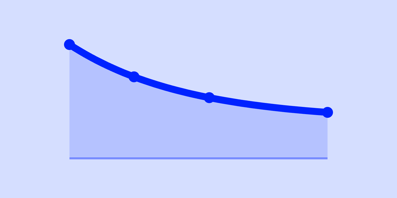
D90 is also the retention metric that maps most directly to lifetime value. In almost every product category, a user who survives to day 90 has reached the flat part of the retention curve. That cohort stops decaying and becomes your durable revenue base.
For the full picture across D1, D7, D14, and D90, see the retention rate benchmarks pillar.
The benchmark: B2B SaaS vs consumer
Treat the ranges as context, not targets.
| Product type | Good D90 retention | What it means |
|---|---|---|
| B2B SaaS / B2B tools | 2.5% to 15.6% | Share of a signup cohort still active at day 90. Median to 90th percentile of B2B technology products. |
| Consumer apps | 1% to 4% | Share of a signup/install cohort still active at day 90. |
For B2B, below 2.5% at day 90 is below the published median. It usually means the product never embedded into a recurring workflow. For consumer apps, anything above 5% is exceptional.
Sources: B2B SaaS 2.5% to 15.6%, Amplitude B2B Technology Product Benchmarks; consumer apps 1% to 4%, AppsFlyer and Adjust mobile retention data. Pendo’s 25% to 35% at 90 days is a returning-user rate, pooled across B2B and B2C, and is not comparable with either row.
The B2B and consumer ranges overlap at the low end.
A B2B tool is bought to do a job that recurs every week (invoicing, deployment, support tickets). “Active” means used on a workday, so the adopters who stick tend to stick hard. The range is wide because free trials and single-seat signups drag the median down while the 90th percentile sits far above it.
A consumer app competes for discretionary attention against every other app on the phone, and most lose. Compare yourself to your own category, and to the same metric, never across the line.
B2B SaaS: 2.5% to 15.6%
For a B2B product, D90 is a proxy for whether you have embedded into a workflow. The range assumes a self-serve or product-led motion, where individual users sign up and either stick or churn. Two things bend it:
- Collaboration and multi-seat usage push it up. The product becomes part of how the group works rather than one person’s choice.
- Seat-based enterprise deals can mask it. If a company bought 200 seats and only 40 people log in at day 90, your contract retention looks fine while your usage retention is poor. Measure logins, not licenses.
If your B2B D90 sits below the published median, no growth tactic will save you. That is a product-market fit problem. Read what product-market fit is before you spend another krona on acquisition.
Consumer apps: 1% to 4%
Consumer retention drops fast. If you have a real product, it then flattens into a small, loyal core. Where the curve flattens matters more than how high it starts.
An app that retains 4% at day 90 and holds it for a year has a far better business than one at 8% that keeps decaying toward zero.
For category-specific consumer context, see the consumer app benchmarks. For the B2B equivalent with unit economics attached, see the B2B SaaS growth benchmarks.
How to read D90 (and where the single number lies)
D90 is one point on a curve. What you want to know is whether the curve has flattened by day 90 or is still sliding.
Two products can both show 12% at day 90. One arrived there and held. The other is dropping a point a week and will be at 8% by day 120. The one that held has product-market fit.
A flat tail is the signal that you have found the users for whom this product is habitual.
The cohort definition decides the number. Measured from signup, it counts everyone who bounced after the first screen, so it reads low. Measured from activation (users who hit the product’s core value at least once), it reads higher and means more.
Measured with no cohort at all, as a returning-user rate, it reads about ten times higher than any cohort figure.
Comparing an activation-based D90 to a signup-based benchmark, or either of them to a returning-user rate, compares different things. Know which one you are holding.
A strong D90 is what makes a long CAC payback period survivable. If users stick for years, you can afford to take a year to earn back acquisition cost.
It is also the engine behind a healthy LTV:CAC ratio, because lifetime value is retention integrated over time. A great D90 with poor monetization still leaves you with no business. A great LTV:CAC that rests on a decaying retention tail will not hold.
How to improve 90-day retention
You cannot move D90 directly; you move the things that produce it. The levers:
- Fix the early curve first. If D1 and D7 are below their ranges (roughly 5% to 25% and 4% to 20% of signups for B2B, estimates), D90 is doomed. You cannot retain at 90 days users who never came back at day 7.
- Find your retained-user behavior, then engineer toward it. Look at the cohort that did survive to day 90. Find what they did in week one that the churned users did not. That behavior, not a generic “aha moment”, is your activation target.
- Build a reason to return, not a reminder to return. Notifications and lifecycle emails buy you a few points at D7 and almost nothing at D90. Long-term retention comes from the product getting more useful the longer you use it: accumulated data, saved work, network effects, integrations into a workflow.
- Watch the floor, not the headline. Track where each cohort’s curve flattens. Raising the floor by one point compounds into more lifetime value than shaving the early drop-off, because the floor is the part that lasts.
See where your D90 lands
The free Scilla benchmark tool charts your retention curve against the B2B and consumer ranges, D1 through D90. You see your 90-day number and where the curve flattens, in six minutes.
Frequently asked questions
See where your numbers actually land
Plot your retention, CAC payback, LTV:CAC and K-factor against the B2B and Consumer bands, and find out whether a good-looking number is real or sitting on a leaky retention curve.
Run the growth diagnostic →