Why Is My Retention Dropping After Day 1? (Diagnosis)

If retention falls off a cliff right after Day 1, the cause is almost always onboarding or value clarity rather than product quality. People came in, did something once, and never reached the moment where the product pays them back. The fix lives in the first session, not in your feature roadmap.
To confirm it, look at the shape of your retention curve instead of a single number. A steep early drop that then flattens is normal. A curve that keeps sliding toward zero is the one to worry about.
Some drop after Day 1 is supposed to happen
Not everyone who tries a product is a fit for it, and the ones who aren’t leave first.
The real questions are how fast, how far, and does it stop.
The early days of a retention curve (Day 0 to roughly Day 7) measure whether the first experience landed. The later days (Day 14 to Day 90) measure whether there is durable value.
A drop after Day 1 is an early-days story. That is good news, because the early days are the cheapest part of the funnel to fix.
What a healthy curve looks like
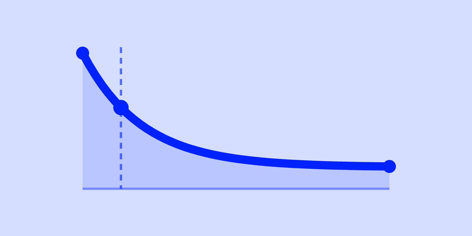
A retention curve plots the share of a cohort (everyone who first used the product on the same day) who come back N days later. It starts at 100% on Day 0 and decays from there.
A healthy curve drops steeply at first, then flattens into a plateau. It is the slice of users who found a reason to keep coming back. A curve that never flattens, and instead slides toward zero, has no durable core.
The benchmark tool uses these healthy ranges for B2B SaaS and consumer apps across the first 90 days:
| Day | Healthy B2B range | Healthy consumer range |
|---|---|---|
| Day 0 | 100% | 100% |
| Day 1 | 5% to 25% (estimate) | 20% to 30% |
| Day 7 | 4% to 20% (estimate) | 8% to 15% |
| Day 14 | 3% to 18% (estimate) | 4% to 8% |
| Day 30 | 2.8% to 16.5% (estimate) | ~2% to 6% |
| Day 90 | 2.5% to 15.6% (Amplitude) | 1% to 4% |
Source: B2B ranges are cohort retention from kpi-benchmarks.md. Day 90 is sourced to Amplitude B2B Technology Product Benchmarks (median to 90th percentile). Day 1, 7, 14 and 30 are estimates kept consistent with it.
Pendo’s B2B figures (50% to 70% Day 1, 40% to 60% Day 7, 25% to 35% at 90 days) are a returning-user rate. That rate reads about ten times higher and is not used here.
Consumer ranges: Day-1 from Adjust and Statista, Day-7 from AppsFlyer and Amplitude, Day-14 from Mixpanel and Amplitude, Day-90 from AppsFlyer and Adjust. The consumer Day-30 row is interpolated between the sourced Day-14 and Day-90 anchors, not independently sourced.
The biggest single drop is between Day 0 and Day 1, and then the slope gets gentler every step. By Day 14 the curve is nearly flat. If your curve does that, your Day-1 drop is the healthy churn of poor-fit users.
These are directional reference ranges, not targets. An enterprise tool people open twice a month and a daily-use consumer app will have legitimate curves that look nothing like each other. Use the range to check you are roughly on the map, then trust the shape over the absolute number.
The two shapes that mean trouble
Shape 1: The cliff (steep drop, no plateau)
Day 1 is well below the range (say, 3% for a B2B tool where the cohort range is 5% to 25%) and it keeps falling.
A cliff this early and this steep is an onboarding / value-clarity problem. People activated, meaning they did the first thing, but never reached the moment where the product’s value became obvious.
This is the most common shape for early-stage products. It is also the most fixable, because the leak sits in the first session.
Shape 2: The slow bleed (decent Day 1, but the curve never flattens)
Day 1 looks fine, even good. But instead of plateauing by Day 14, the curve keeps declining month over month. People did get initial value, which is why Day 1 held up. The product just isn’t earning a permanent slot in their week.
This is a core-value or core-loop problem rather than an onboarding one. The product works once or twice, then the reason to return runs out. No amount of onboarding polish fixes this; the work is in the product itself.
The benchmark tool’s growth model splits users into a stable base and new cohorts. The stable base is long-tenured users who survived the funnel and churn slowly. New cohorts are this month’s arrivals, who retain at your Month-1 rate and either graduate into the base or leave.
A cliff kills new cohorts before they can graduate. A slow bleed means even the base is eroding.
How to diagnose your own drop in four steps
You need one cohort retention chart and a willingness to be honest about the shape.
- Plot the curve, don’t read the point. Get Day 0, 1, 7, 14, 30 (90 if you have the history) for a single cohort.
- Find the plateau, or its absence. Does the curve flatten by Day 14 to 30? If yes, you have a core. If it’s still visibly sliding, you don’t (yet).
- Compare Day 1 to the range. For B2B, the Day-1 cohort retention range is 5% to 25%. For consumer, it is 20% to 30% (Adjust, Statista). Below 5% for B2B, or below the consumer floor, is a weak first impression and an onboarding/value-clarity flag.
- Match your shape to a fix. Cliff with no plateau, low Day 1 → fix the first session. Decent Day 1 but no plateau → fix the core loop. Steep-but-flattening curve sitting in the range → you’re fine; go work on acquisition instead.
Teams that skip diagnosis reach straight for onboarding tweaks. That is the right fix for a cliff and a waste of time for a slow bleed.
How to fix a Day-1 cliff (the onboarding / value-clarity case)
If you have diagnosed a cliff (low Day 1, no plateau), the leak is in the gap between activation and first real value. The levers, in rough order of impact:
- Make the first valuable action unmissable. Strip the first session down to the one action that delivers a payoff, and remove everything competing with it.
- Shorten time-to-value. Every step, form field, and empty state between sign-up and the first “oh, I get it” moment is a place people leave. Count those steps. Cut half of them.
- Pre-fill the empty room. Templates, sample data, a guided first task: anything that lets someone see the value before they have to build it themselves.
- Tell them why to come back, on day one. A cliff often means people got value once but had no idea there was a reason to return tomorrow. Make the recurring reason explicit in the first session.
New features are not on this list. Teams that keep reaching for features anyway slide into the product death cycle.
If you fix all of this and the curve still won’t flatten, you have Shape 2, a core-value problem.
A point-by-point walk through the healthy ranges is in our piece on retention rate benchmarks. The broader B2B context is in the 2026 B2B SaaS growth benchmarks.
A note on activation vs. retention (they’re not the same number)
Activation is whether a new user completes the first key action at all. Retention is whether they come back afterward. A Day-1 retention drop can come from either group. Some people never activated, so there was nothing to come back for. Others activated but didn’t see why to return.
We are not putting activation benchmark numbers here. The benchmark tool’s source of truth covers retention ranges but carries no sourced activation figures. Consumer activation tends to run lower than B2B on both onboarding completion and early activation, but treat that as direction, not a number.
Before you blame onboarding, check whether your activation rate is healthy. If activation is fine but Day-1 retention still cliffs, the problem is value clarity after activation, not the activation step itself.
See where your curve lands
Scilla’s free benchmark tool charts your retention against B2B and consumer reference ranges in six minutes. It shows the curve shape, not just a single number. It also runs the stable-base / new-cohort growth model above, so you see whether your Day-1 drop is healthy thinning or a real leak. It won’t pretend the benchmark is a target.
Sources
- Pendo, Product Benchmarks: https://www.pendo.io/resources/product-benchmarks/
- Amplitude, Product Analytics: https://amplitude.com/product-analytics
- Mixpanel: https://www.mixpanel.com/
- Adjust, Benchmarks: https://www.adjust.com/resources/benchmarks/
- AppsFlyer, Reports: https://www.appsflyer.com/resources/reports/
- Statista: https://www.statista.com/
Benchmark ranges and the stable-base / new-cohort growth model are drawn from Scilla’s benchmark tool source of truth (docs/kpi-benchmarks.md, docs/growth-model.md). Activation figures are intentionally omitted because that source carries no sourced activation benchmarks.
Frequently asked questions
See where your numbers actually land
Plot your retention, CAC payback, LTV:CAC and K-factor against the B2B and Consumer bands, and find out whether a good-looking number is real or sitting on a leaky retention curve.
Run the growth diagnostic →