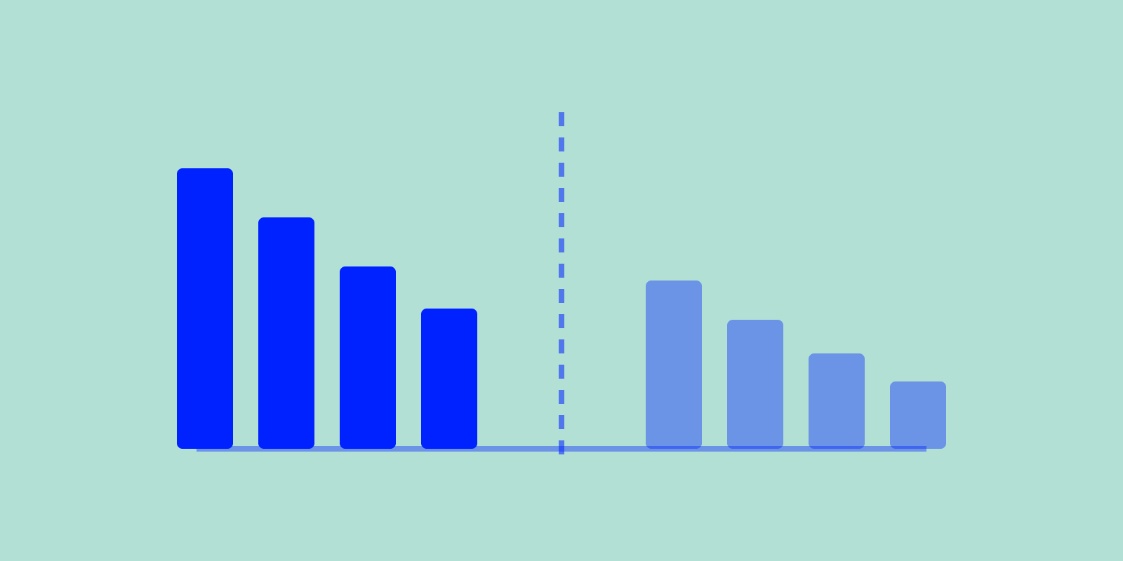
B2B vs Consumer Growth: Why Benchmarks Differ

One benchmark page quotes Pendo’s B2B Day-7 returning-user rate, 40 to 60%. Another says a consumer app’s Day-7 runs 8 to 15%. Put your 12% next to the B2B number and you panic, next to the consumer number and you relax. Both readings can be wrong. The pages report different metrics, and B2B and consumer products grow by different mechanics.
Before you compare your number to anything, know which profile you are in and which metric the benchmark measures. Founders grab a “good retention rate” from a blog post and never check whether it came from a B2B or consumer dataset.
B2B vs consumer growth benchmarks: don’t compare across profiles
B2B SaaS and consumer apps follow different growth mechanics, so their benchmarks are not interchangeable. A consumer app acquires huge numbers of low-intent users and loses most of them fast. A B2B tool acquires fewer, higher-intent users who embed it into their work and stay for years.
That one structural difference cascades into every metric: retention, virality, unit economics, payback.
The benchmark tool at benchmark.scilla.studio asks you to pick a profile first, B2B SaaS or Consumer, because every range it draws afterward depends on that choice.
Retention: the clearest split
Cohort retention = the percentage of everyone who signed up who is still active a given number of days later. That is the metric the benchmark tool asks for and the one this table shows.
| Metric | B2B SaaS (cohort retention) | Consumer apps (cohort retention) |
|---|---|---|
| Day-1 retention | 5 to 25% (estimate) | 20 to 30% |
| Day-7 retention | 4 to 20% (estimate) | 8 to 15% |
| Day-14 retention | 3 to 18% (estimate) | 4 to 8% |
| Day-90 retention | 2.5 to 15.6% (Amplitude) | 1 to 4% |
Sources: Amplitude B2B Technology Product Benchmarks (B2B Day 90 cohort retention; the earlier B2B points are estimates); Adjust, AppsFlyer, Amplitude, Mixpanel, Statista (consumer). Pendo’s returning-user rates (50 to 70% Day 1, 40 to 60% Day 7, 25 to 35% at 90 days) measure something else and are not comparable.
Look at Day-90, the one B2B point with a matched source. Amplitude’s B2B range runs 2.5 to 15.6% (median to 90th percentile). The consumer range runs 1 to 4%. The two overlap at the low end.
The order-of-magnitude gap people expect comes from putting Pendo’s B2B returning-user rate (40 to 60% at Day 7) next to consumer cohort retention (8 to 15%).
So which number is “good”? For a consumer app, Day-7 above 15% is excellent. For a B2B tool, a Day-90 figure below Amplitude’s 2.5% median says the core workflow isn’t sticking.
The profiles differ in the shape of the curve and in what “active” means. Someone who installs a consumer app saw an ad, got curious, and tapped. The cost of leaving is zero and the alternatives are infinite, so the curve drops steeply and holds a thin tail.
Someone who adopts a B2B tool usually has a job to do, often inside a team, and uses it on workdays. So the curve flattens into a base of accounts that stay for years.
A high Day-90 number can still hide a steep, late drop. Watch the shape of the curve, not just the endpoint. Read Why retention drops after Day 1 and the D90 retention deep-dive for how to read the late tail.
K-factor: virality is the consumer advantage
K-factor (viral coefficient) = how many additional users each new user generates through sharing, invitations, and other viral loops before their influence runs out. K > 1 is self-sustaining viral growth.
| Product type | K-factor (avg) |
|---|---|
| B2B SaaS | 0.1 to 0.3 |
| Consumer apps | 0.3 to 0.7 (rarely >1) |
Sources: Reforge, Andrew Chen.
B2B virality is usually weak, and 0.1 to 0.3 is normal. Anything above 0.3 is unusually strong, unless the product has built-in collaboration loops (shared workspaces, documents that pull in colleagues).
Consumer products live in social contexts where sharing is native. There 0.3 to 0.7 is the working range, and even 0.5 counts as very strong. K above 1 is extremely rare in either world.
So the same K = 0.35 reads as “remarkable, dig into what’s working” for a B2B tool and “solid but not exceptional” for a consumer app. The K-factor explainer measures this loop by loop.
The raw coefficient also hides cycle time. A B2B loop where one customer takes months to produce the next can have a respectable K on paper. It still barely moves growth, because the loop turns so slowly. A consumer app where users share daily compounds the same K many times faster.
Unit economics: faster-but-fragile vs slower-but-durable
LTV:CAC ratio = lifetime value of a customer divided by the cost to acquire them.
| Product type | LTV:CAC (avg) |
|---|---|
| B2B SaaS | 3:1 to 5:1 |
| Consumer apps | 2:1 to 4:1 (ideal ≈3:1) |
Sources: Bessemer State of the Cloud, OpenView SaaS Benchmarks, Wall Street Prep (B2B); a16z, AppsFlyer (consumer).
The ranges overlap more here, but the shape of “good” still differs. For B2B, ~3:1 is the minimum healthy baseline. Above 5:1 often signals you’re under-investing in growth.
For consumer, ratios below 2:1 burn cash, and above 4:1 usually means scale is constrained. The same 4.5:1 ratio reads as “you have room to spend more aggressively” for B2B and “near the top of what’s realistic” for consumer.
The sharper divide is CAC payback period: how many months of revenue it takes to recoup the cost of acquiring a customer.
| Product type | CAC payback (avg) |
|---|---|
| B2B SaaS | 6 to 12 months (SMB/self-serve), 12 to 24 months (enterprise) |
| Consumer apps | 1 to 6 months |
Sources: OpenView, KeyBanc SaaS Survey (B2B); AppsFlyer, Mobile Dev Memo (consumer).
Beyond 6 months usually fails at scale, because consumer retention won’t carry a long payback. B2B can tolerate 12, even 24 months for enterprise deals. A B2B account that survives the first quarter tends to stay for years, and that stickiness funds the payback.
See why a long CAC payback isn’t automatically a problem and the full CAC payback breakdown.
Activation: where the same word measures different things
What counts as activation? The share of new users who complete the early actions that signal they’ve reached the product’s core value: often onboarding completion, then a first “aha” action.
Activation runs higher for B2B than consumer. The user arrived with intent and a task, and B2B onboarding is often guided or even sales-assisted. Consumer activation is lower because much of the top of the funnel is curiosity.
“Activation” doesn’t mean the same event across products, so a cross-product benchmark would compare different events under one label. For one product it’s “invited a teammate,” for another it’s “completed a workout,” for a third it’s “connected a data source.” Define your own activation moment, then track it against your own history.
How the metrics interact (why one number always lies)
B2B trades fast acquisition for durability. Virality is lower and payback slower, but the retention curve flattens into a base of long-tenured accounts, which funds the long payback. Consumer trades durability for speed. Virality is stronger and payback fast, but the base turns over quickly, which is why the payback has to be fast.
Understand which range your profile puts you in, on the metric you measure. Then watch whether your own curve is flattening and your own loops are compounding.
See where your numbers land
The free benchmark tool charts your retention curve, K-factor, and unit economics against the B2B SaaS and Consumer ranges side by side. Pick your profile, paste your numbers, and see in six minutes whether you’re inside the range and which metric is dragging. Try it at benchmark.scilla.studio.
For the full profile-specific breakdowns, start with the B2B SaaS growth benchmarks or the Consumer app benchmarks.
Frequently asked questions
See where your numbers actually land
Plot your retention, CAC payback, LTV:CAC and K-factor against the B2B and Consumer bands, and find out whether a good-looking number is real or sitting on a leaky retention curve.
Run the growth diagnostic →