How to Read a Retention Curve: Plateau & Slope

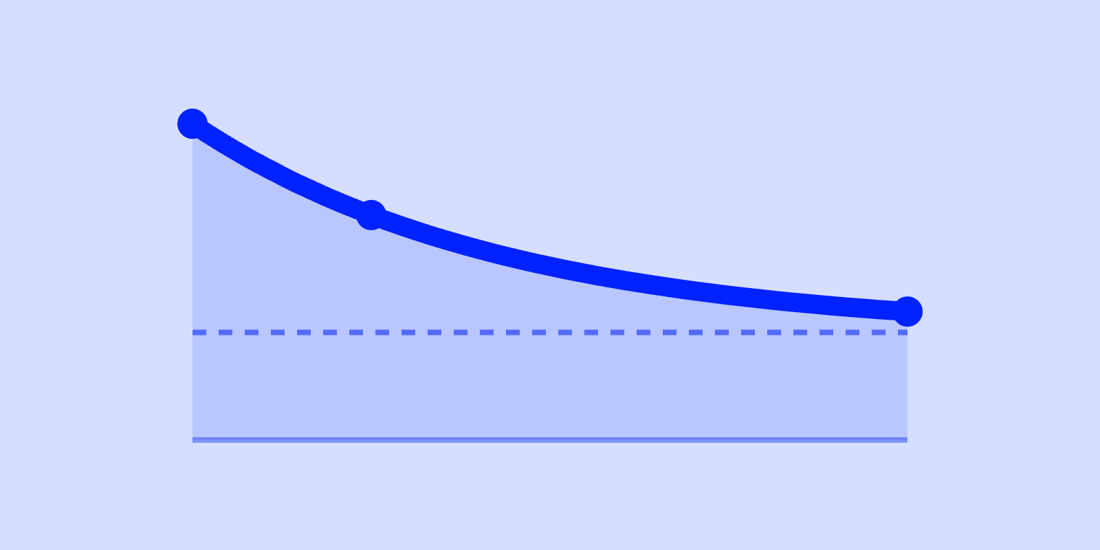
A retention curve has two things worth reading: the slope and the plateau. The slope is how fast you lose users in the first days. The plateau is the floor the curve settles at, if it settles at all. The plateau tells you whether you have a product people keep coming back to.
A curve that flattens at 30% is a business. A curve that never flattens is a leaky bucket, however gentle the early drop looks.
The benchmark ranges below are the ones the scilla.studio benchmark tool charts against, with a note on where each one can mislead you.
What is a retention curve?
A retention curve plots the percentage of a cohort still active over time, starting from 100% on day zero. Take everyone who signed up (or activated) in a given week. Measure what fraction of them are still active 1 day later, then 7, 14, 30 and 90 days later. Draw the line through those points.
Two properties define the shape:
- The slope: how steeply the line falls early. That is the initial drop-off, people who tried the product once and did not come back.
- The plateau: the level the curve settles at once the early churn has burned off. That is your habitual user base.
A retention curve shows two populations stacked on top of each other. The tourists showed up, did not find the value, and left fast. The residents are the people for whom the product clicked. The early slope measures how many tourists you let in. The plateau measures how many residents you keep.
Reading the slope: the early cliff
The first few days of a retention curve always drop. Not everyone who signs up was ever going to stick. The question is how much, and how fast.
For B2B SaaS the benchmark tool grades cohort retention, the share of all signups still active. The range is roughly 5 to 25% at Day 1 and 4 to 20% at Day 7 (estimates, no B2B-specific source).
Pendo’s often-quoted B2B figures (50 to 70% at Day 1, 40 to 60% at Day 7) are a returning-user rate, the share of already-active users who come back. Those read about ten times higher than cohort retention.
For consumer apps, cohort retention lands at 20 to 30% on Day 1 and 8 to 15% on Day 7.
| Metric | B2B SaaS | Consumer app |
|---|---|---|
| Day-1 retention | 5 to 25% (estimate) | 20 to 30% |
| Day-7 retention | 4 to 20% (estimate) | 8 to 15% |
| Day-14 retention | 3 to 18% (estimate) | 4 to 8% |
| 90-day retention | 2.5 to 15.6% (Amplitude) | 1 to 4% |
B2B figures are cohort retention (Amplitude for Day 90; Day 1, Day 7 and Day 14 are estimates). Pendo’s returning-user rates (50 to 70% Day 1, 40 to 60% Day 7, 25 to 35% at 90 days) are not comparable. Consumer sources: Adjust, Statista (Day 1); AppsFlyer, Amplitude (Day 7); Mixpanel, Amplitude (Day 14); AppsFlyer, Adjust (Day 90).
B2B and consumer curves differ in shape and in what “active” means. Read each column against its own product type.
A slope steeper than the range usually points upstream of the product itself. The most common culprits:
- Onboarding friction or unclear value. If people cannot get to the “aha” fast, they never form the habit.
- Acquisition mismatch. If you buy or attract users who were never a fit, they churn on day one however good the product is.
Reading the plateau: where the curve settles
The plateau is the level at which the curve stops falling and goes roughly flat. It is the fraction of each cohort that turned into durable, returning users. Draw a horizontal line through the right-hand end of the curve. The height of that line is the plateau.
A curve that flattens, even at a modest height, means a group of people gets recurring value and keeps coming back. That is the signal of product-market fit.
A curve that never flattens, one that keeps sliding toward zero month after month, means you have no retained base.
Which matters more, a gentle slope or a high plateau? The plateau wins almost every time.
- Product A loses users gently, but the curve never flattens; it drifts down 2 to 3 points every month.
- Product B drops sharply in week one, then flattens hard and holds steady for months.
Product A looks healthier on day seven. Product B is the business. Its sharp early drop is tourists leaving. Underneath them sits a solid, flat resident base that compounds.
The B2B benchmark curve the tool charts against settles into the 2.5 to 15.6% range by Day 90 (Amplitude B2B Technology Product Benchmarks, median to 90th percentile). Below 2.5% at 90 days is below the published B2B median. Pendo’s 25 to 35% at 90 days is a returning-user rate, a different metric.
For consumer, the range is 1 to 4% at Day 90, and anything above 5% is exceptional (AppsFlyer, Adjust).
How to tell a plateau from a slow bleed
A true plateau flattens and holds. Month over month, the line moves a fraction of a point. A slow bleed looks flat over a short window but is still trending down. It falls slowly enough that a 30-day view hides it.
How to separate them:
- Check whether the drop shrinks each period. A healthy curve loses (say) 20 points the first week, 5 the second, 1 the third. A bleed loses a steady 2 to 3 points every month.
- Extend the window. A 90-day chart cannot distinguish a 28% plateau from a curve that will sit at 18% by month six.
- Watch the flattening rather than the absolute number. A 15% plateau that is flat beats a 25% reading that is still sliding.
How to improve each part of the curve
The two parts of the curve have two different fixes.
To lift the early slope, work the path to first value:
- Shorten time-to-aha.
- Cut onboarding steps.
- Make the core action obvious in the first session.
- Fix acquisition targeting so you stop importing users who were never a fit.
The slope responds to onboarding and targeting changes within a cohort or two.
We do not publish benchmarks we cannot source, so treat activation as a direction rather than a target.
Lifting the plateau is harder and slower, because the plateau reflects whether the product delivers recurring value to a real segment. What raises the plateau:
- Deepen the core loop.
- Find the segment for whom the value is strongest and serve them better.
- Build reasons to return that sit inside the job itself, rather than push notifications bolted on top.
Say your blended Day-90 plateau sits at 2%, under the 2.5 to 15.6% B2B cohort range. The usual move is to find the sub-segment that already flattens near 12% and reshape the product around their core loop. As that segment grows, the blended floor climbs toward the range.
Retention and viral growth feed each other. A daily-active user gives you about 30 shots a month at a referral or shared artifact, versus one or two for a barely-retained one. (We unpack that loop in our K-factor article.)
Benchmarks are context, not targets
Your business model changes what “good” looks like more than your category does. A freemium consumer app, a self-serve SMB tool, and an enterprise sales-led platform have three completely different healthy curves.
Read your own curve first: find the slope, find the plateau, decide whether it is flattening or bleeding. Then glance at the range to see roughly where you sit.
See where your curve lands
The free benchmark tool charts your retention, K-factor, and unit economics against these B2B and Consumer ranges in six minutes. It shows the flattening rather than only the day-90 number. You bring your cohort data. It draws the curve and the range side by side, so you can read the slope and the plateau at a glance.
Frequently asked questions
See where your numbers actually land
Plot your retention, CAC payback, LTV:CAC and K-factor against the B2B and Consumer bands, and find out whether a good-looking number is real or sitting on a leaky retention curve.
Run the growth diagnostic →